Untitled Exteriors // Youngsuk Suh

archaic_youngsuksuh_exterior014  

Untitled Exteriors by Youngsuk Suh


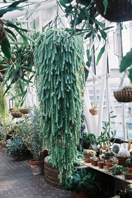
Korean photographer Youngsuk Suh moved to the United States to study photography in 1994. Whether he is photographing interiors, landscapes, soccer players, or gas stations, Suh's luminous photographs show a unique approach to lighting and the treatment of space. Suh maintains an objective distance from his subjects, witnessing rather than intervening.


archaic_youngsuksuh_exterior011


archaic_youngsuksuh_exterior012


archaic_youngsuksuh_exterior013


archaic_youngsuksuh_exterior016


archaic_youngsuksuh_exterior017


archaic_youngsuksuh_exterior015


#

Yangtze, The Long River by Nadav Kander

archaic_NadavKander_YangtzeRiver26 

Yangtze, The Long River by Nadav Kander


Yangtze, The Long River documents the people and landscape along the banks of the river, and captures the changes that are happening in China at the moment: the large scale development, the tearing down and building up, migration, the way that history and progression is seen.

“After several trips to different parts of the river, it became clear that what I was responding to and how I felt whilst being in china was permeating into my pictures; a formalness and unease, a country that feels both at the beginning of a new era and at odds with itself.

China is a nation that appears to be severing its roots by destroying its past in the wake of the sheer force of its moving “forward” at such an astounding and unnatural pace. A people scarring their country and a country scarring its people.

Although it was never my intention to make documentary pictures, the sociological context of this project is very important and ever-present. Do we have to destroy to develop?

The scale of development in China has left most places unrecognisable. Many Chinese will never be able to visit the places where they grew up, because they no longer exist. China is progressing rapidly, and the landscape—both economically and physically—is changing daily. These are the photographs that can never be taken again.”

Nadav Kander


archaic_NadavKander_YangtzeRiver21

archaic_NadavKander_YangtzeRiver25

archaic_NadavKander_YangtzeRiver29

archaic_NadavKander_YangtzeRiver4

archaic_NadavKander_YangtzeRiver43

archaic_NadavKander_YangtzeRiver24

archaic_NadavKander_YangtzeRiver31

archaic_NadavKander_YangtzeRiver6

archaic_NadavKander_YangtzeRiver30

archaic_NadavKander_YangtzeRiver49

archaic_NadavKander_YangtzeRiver13

archaic_NadavKander_YangtzeRiver33

archaic_NadavKander_YangtzeRiver1

archaic_NadavKander_YangtzeRiver38

archaic_NadavKander_YangtzeRiver15

archaic_NadavKander_YangtzeRiver47

archaic_NadavKander_YangtzeRiver9

archaic_NadavKander_YangtzeRiver40

archaic_NadavKander_YangtzeRiver11

archaic_NadavKander_YangtzeRiver32


All Photographs by Nadav Kander

Whitewash // Nicholas Alan Cope

COPE_WHITEWASH_13 

Whitewash by Nicholas Alan Cope


Nicholas Alan Cope's photographs evoke a unique vision of Los Angeles and its contrasts as seen exclusively through its everyday architecture.

Searching for the sublime core of the city's true nature, Cope strips away the extraneous, and focuses on the sheer beauty and simplicity of the cityscape. To an outsider, the profound cultural, historical, and architectural imprint of the City of Angels can be lost amongst the unsightly sprawl of stucco, strip malls, and irrelevant adornment.

While the sunlight can be unforgiving and harsh, bleaching the landscape into a pale hue, the allure, for Cope, lies in the consistency and ubiquity of the buildings combined with the severity of the light accentuating the dramatic elegance of the architecture. Whitewash utilizes the whitest whites, the blackest blacks, and the modern and stark architecture of an idealized future that never arrived to tell the visual story of LA's uniquely conflicted soul.

Raised in Maryland, Nicholas moved to Los Angeles in 2004 and attended Art Center College of Design. Since graduating Nicholas has worked for a number of commercial and editorial clients while also working on personal projects. His first book Whitewash was released by powerHouse Books in April of 2013.


Words and images: Courtesy of Nicholas Alan Cope


COPE_WHITEWASH_01

COPE_WHITEWASH_02

COPE_WHITEWASH_03

COPE_WHITEWASH_06

COPE_WHITEWASH_09

COPE_WHITEWASH_08

COPE_WHITEWASH_05

COPE_WHITEWASH_30

COPE_WHITEWASH_31

COPE_WHITEWASH_39

A++ // Matteo Cremonesi

10431692_529377793860467_1299376689649980167_n  

A++ exhibition by Matteo Cremonesi

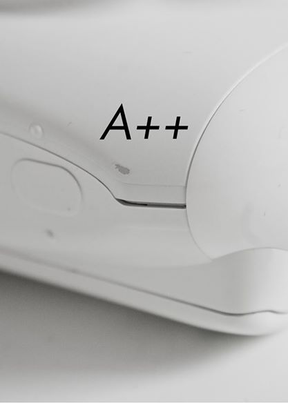
  A photographic practice grounded on close-ups, which pays a special attention to creating synthetic, impersonal, austere, ephemeral, formally balanced, polite images, that describe and express the detail, what’s minute, the “skin” or thin surface of things over and over. Attributing and assigning to such tendency for formalization the ability to emotionally narrate attitudes and the meaning of a discourse, or maybe, more simply, just a “sensitivity”.

Cremonesi proposes a reconfiguration of landscape photography, which, from the static take onto the common object moves towards a surfacing practice, expressed through the innocence and ambiguity of the latter. It is also framed by the effects of patinas and by the helplessness of the look.

"Sculptures" is a series of works composed of collections (Bin, Printer, Photocopier, Washer, Camera, Mirror) of photographic images of everyday objects. The images report subjects, shapes, materials. Lingering on them through repeated formal cuts to investigate their characteristics. The search for an ideal dimension of the subject together with the attempt to look at it as if recording natural subjects becomes a chance to carry out a perceptual reflection with the purpose of producing a representation of the contemporary technological habitat which could establish a connection with the very perception of what is “natural”.


A++ by artist Matteo Cremonesi at Jarach Gallery in Venice.

Still on till November 8th.


10417687_529370890527824_7701491190670112154_n

1902926_529370153861231_5452333173415684965_n

10647184_529371903861056_5859477314310659536_n

10626663_529372033861043_3714310938084803820_n

03_A-_sculpture_printer_matteo_cremonesi_jarachgallery-1024x649

Bildschirmfoto 2014-11-01 um 12.08.49

04_A-_sculpture_bin_matteo_cremonesi_jarachgallery-1024x537

Bildschirmfoto 2014-11-01 um 12.08.20

05_A-_sculpture_mirror_matteo_cremonesi_jarachgallery-1024x641

06_A-_sculpture_photocopier_matteo_cremonesi_jarachgallery-1024x669


 Photography: Courtsey of Matteo Cremonesi


10551686_529372400527673_2790157232950430923_o

Urban Nature // Lena C. Emery

archaic_x_lenaemery01.jpg  

Urban Nature by Lena C. Emery 


Urban Nature - The primary difference between art and architecture is that architecture doesn't only show how the world can and ought to be; it actually makes a part of the world the way it should be and is. Urban Nature is a formal study of architecture in the modern city and specifically the occurrence of natural elements within it. The key task of architecture should be "interpreting the world as a meaningful order in which the individual can find his place in the midst of nature and in the midst of a community". Karsten Harries


All photographs by Lena C.Emery


archaic_x_lenaemery02.jpg


archaic_x_lenaemery03.jpg


archaic_x_lenaemery04.jpg


archaic_x_lenaemery05.jpg


archaic_x_lenaemery07.jpg


archaic_x_lenaemery11.jpg


archaic_x_lenaemery08.jpg


archaic_x_lenaemery09.jpg


archaic_x_lenaemery06.jpg


archaic_x_lenaemery10.jpg


// Muller van Severen

1-zit_2vrsite  

// Muller van Severen


portretMullervanseveren


"Muller van Severen" is another great design export from Belgium.

The design of Fien Muller and Hannes Van Severen, who are also both practicing as visual artists, is something in between art and furniture. They call it a 'furniture project'.The duo met in Gent, where Fien was studying photography and Hannes plastics. No wonder their collections can be seen as pieces of art and remind of sculptural objects.

The furniture is made of a thin wire structure, that frames the sculpture and has a transparent character. Like 'drawings in a space' thats how the designer like to call it. The minimalistic use of material and construction leads to clear forms and an own timeless aesthetic.

We are pretty sure that we will hear a lot more about their great designs in the future!

If you are also in love with their work, try to step by the new exhibition of their design at Gallery Valerie_Traan in Antwerp till 25 of October!


11

sculptuur11

zetel_leder-1024x682

zetel_detail2-1024x682

rack+table-brass_11

textielzitvoorsite

photography by Muller van Severen